Toiro
Project Overview
This project focused on redesigning a nonprofit organization’s website to improve clarity, usability, and overall communication. The goal was to create a platform that clearly conveys the organization’s values, social impact, story, and worldview in a way that is easy for first-time visitors to understand.
Although this project was completed as part of a school assignment, I approached it as a real-world project. After development, I presented the outcome to the organization’s directors and held a meeting to discuss how the design could be applied and maintained for long-term use.
Role
UI/UX Designer & Developer
Collaborators
Solo work
Project Duration
12 Jan 2026 - 23 Jan 2026
( 2 weeks )
Challenge
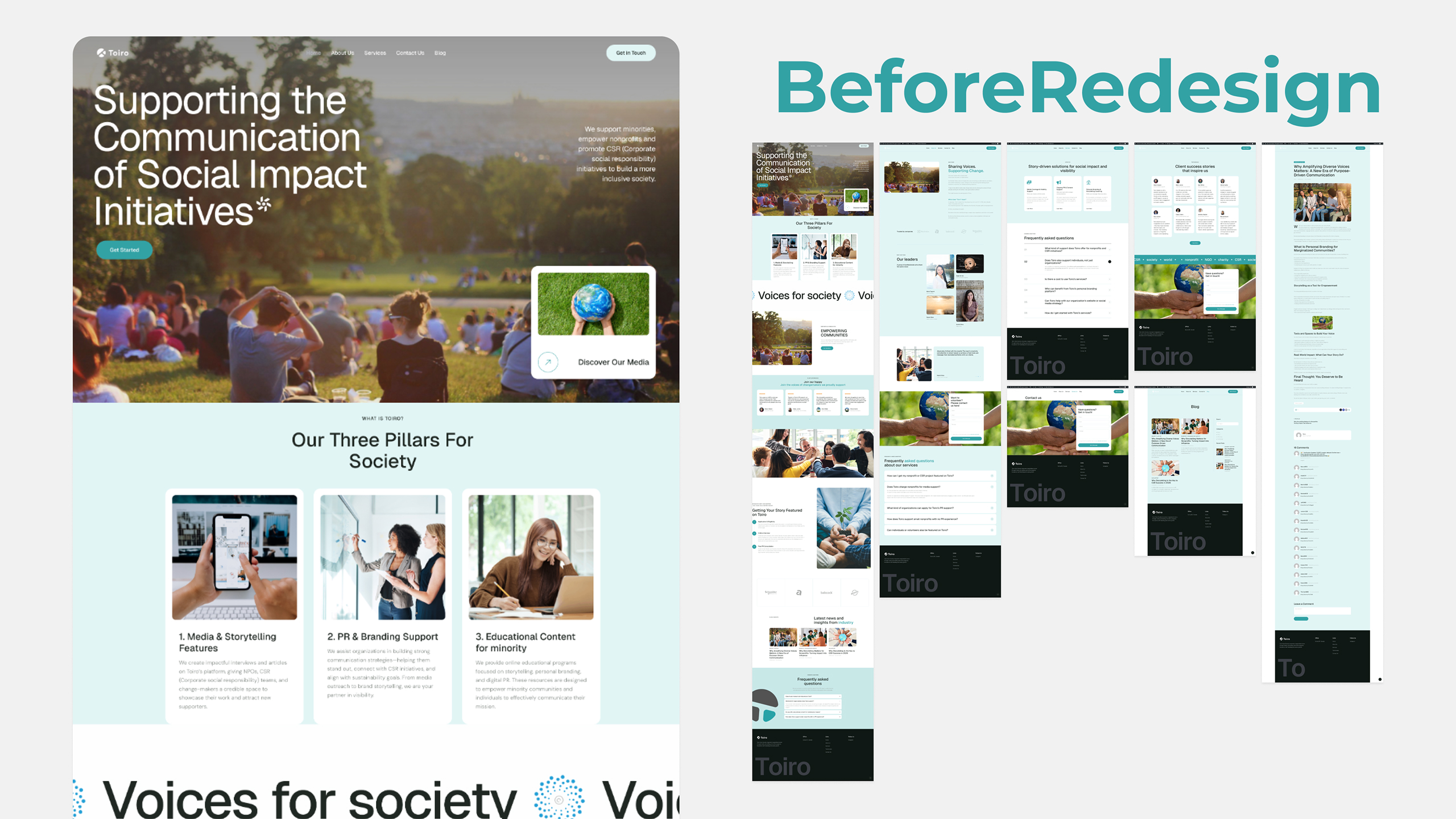
The existing website contained meaningful content, but its structure made it difficult for first-time visitors to understand what the organization offers and what kind of impact it creates. Key information was not immediately clear, which reduced engagement.
Solution
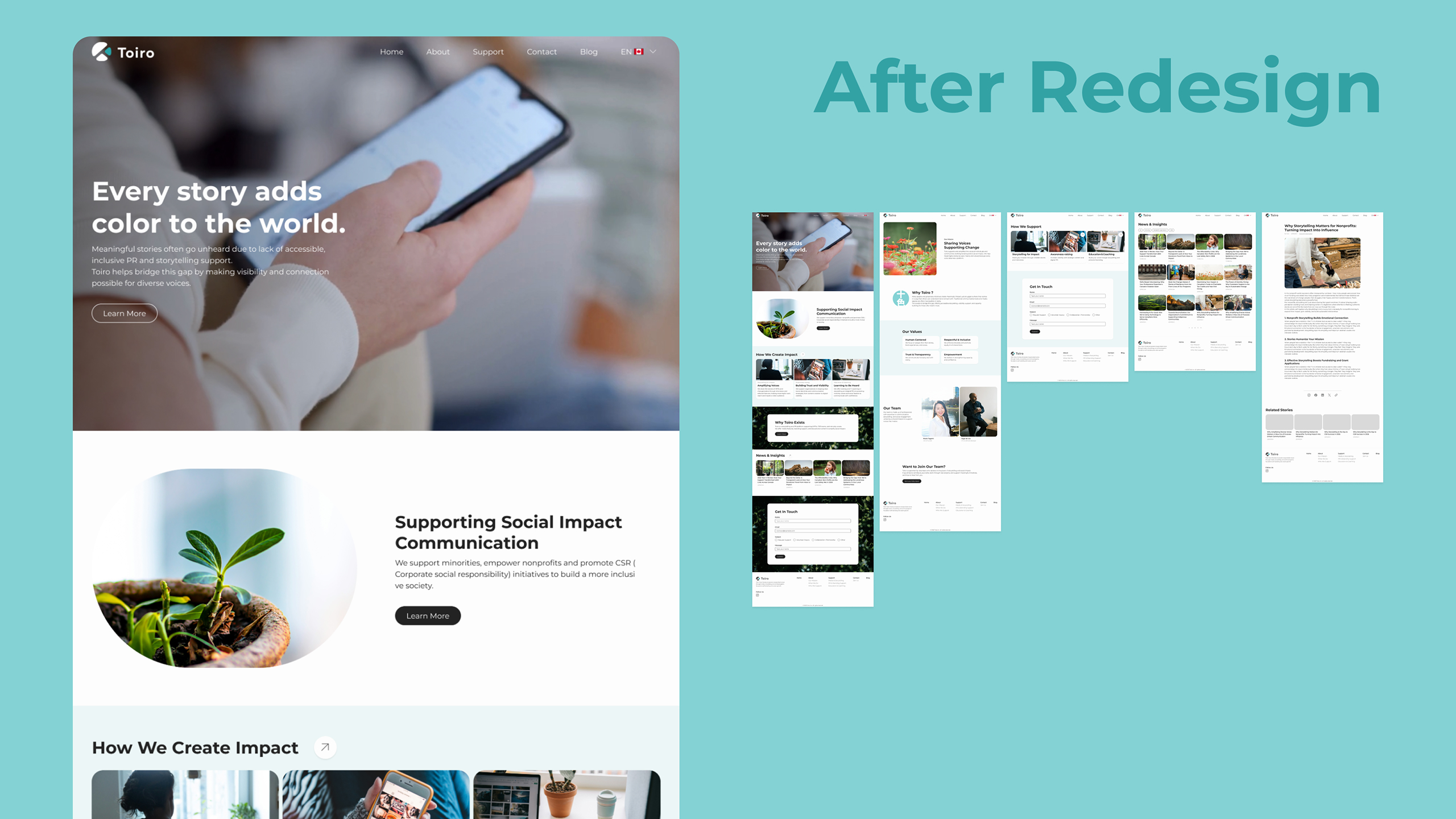
To address this issue, I redesigned the site structure and information hierarchy so key messages such as the mission, support areas, and impact are immediately visible. This allows first-time visitors to quickly understand the organization’s purpose and engage with the site more easily.
Approach
STEP1: Discover
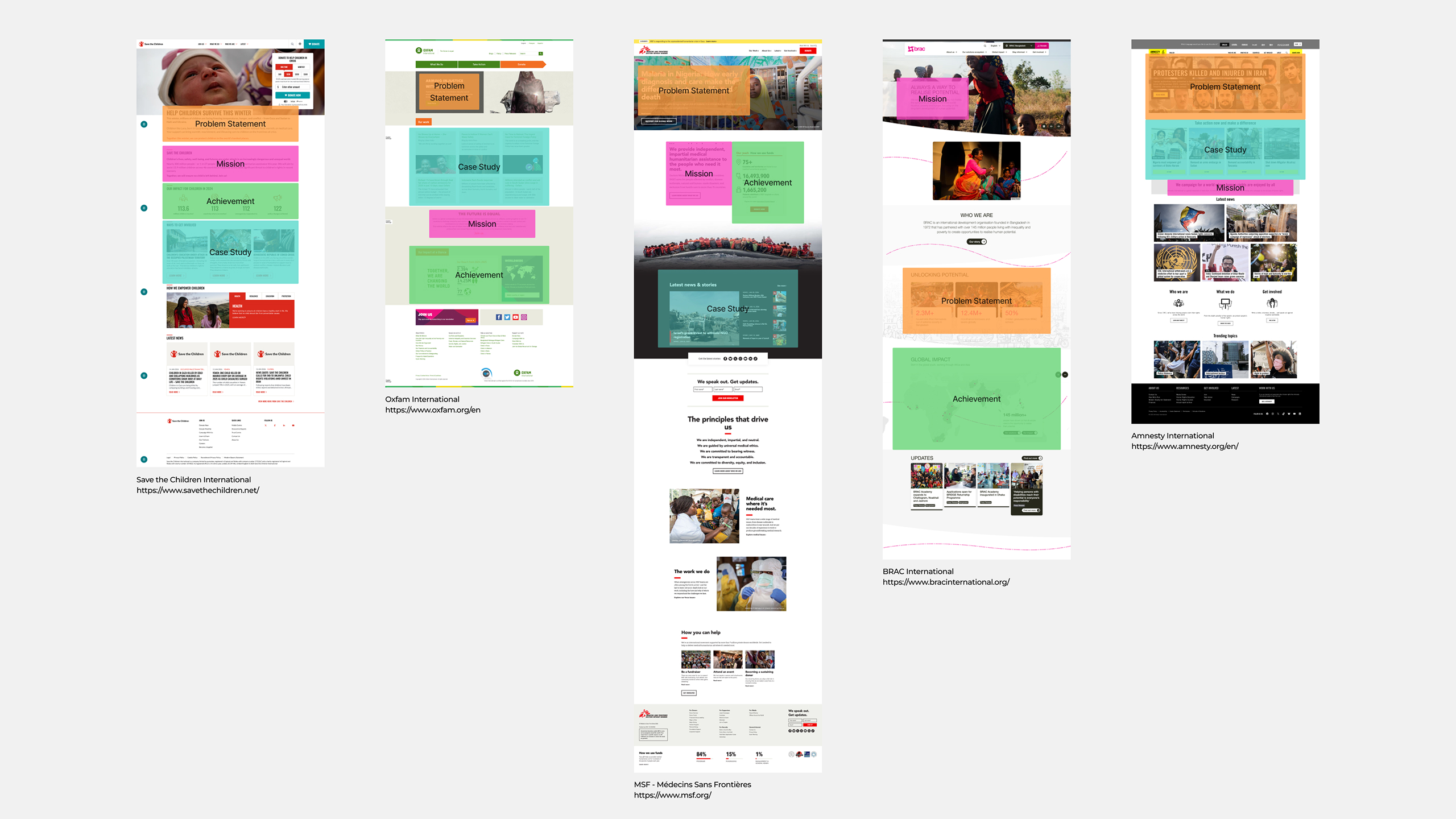
I began by reviewing the existing website and content. The CEO requested that the homepage feel more like a nonprofit website, so I researched some NPO sites to understand common patterns and content structure. Through this research, I identified key elements such as problem statements, mission statements, achievements, and case studies.
I also reviewed the CEO’s design preferences and reference websites. One important insight was her preference for a cleaner design with more white space, even though the current website relied heavily on light teal backgrounds.
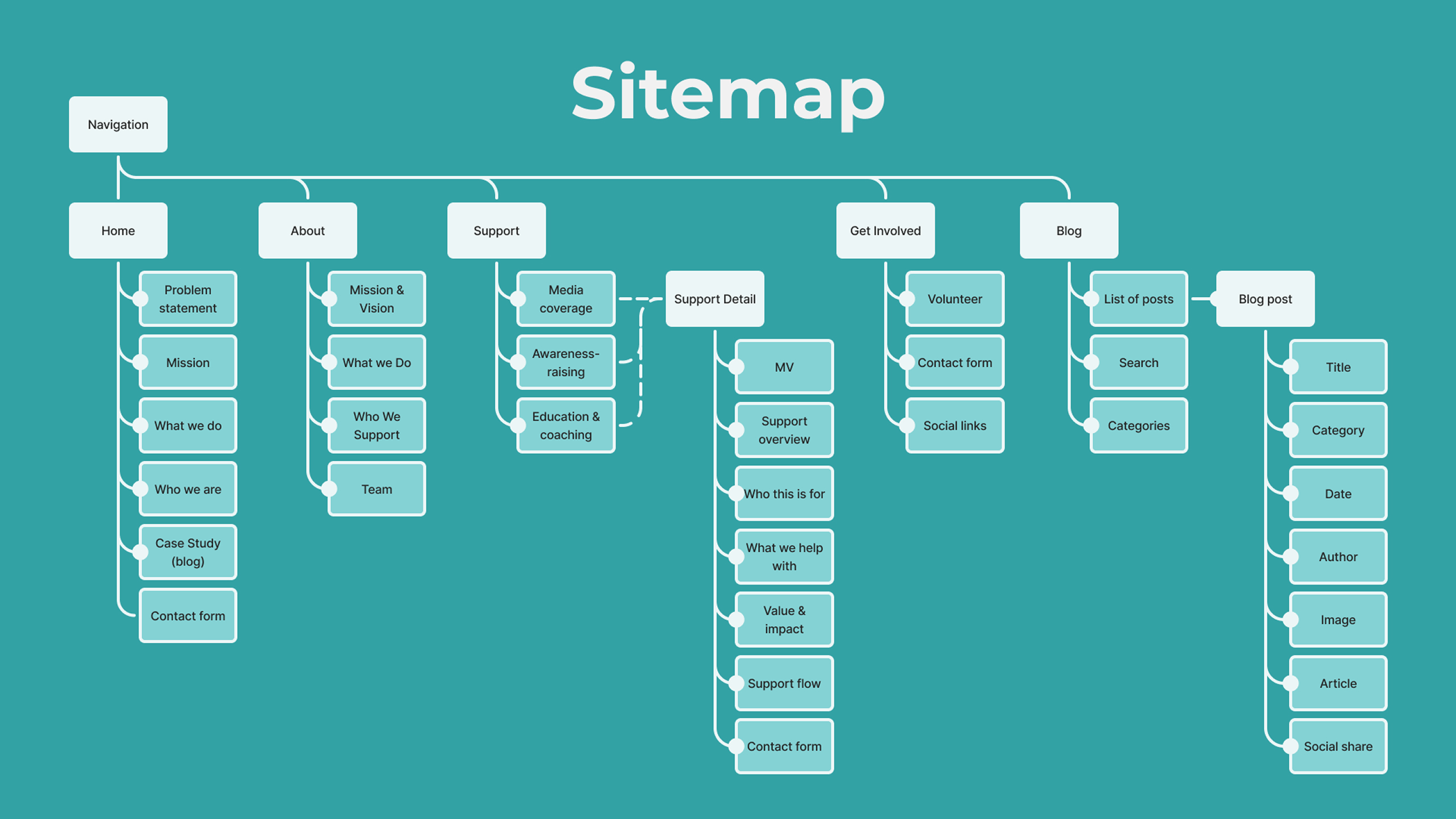
STEP2: Define
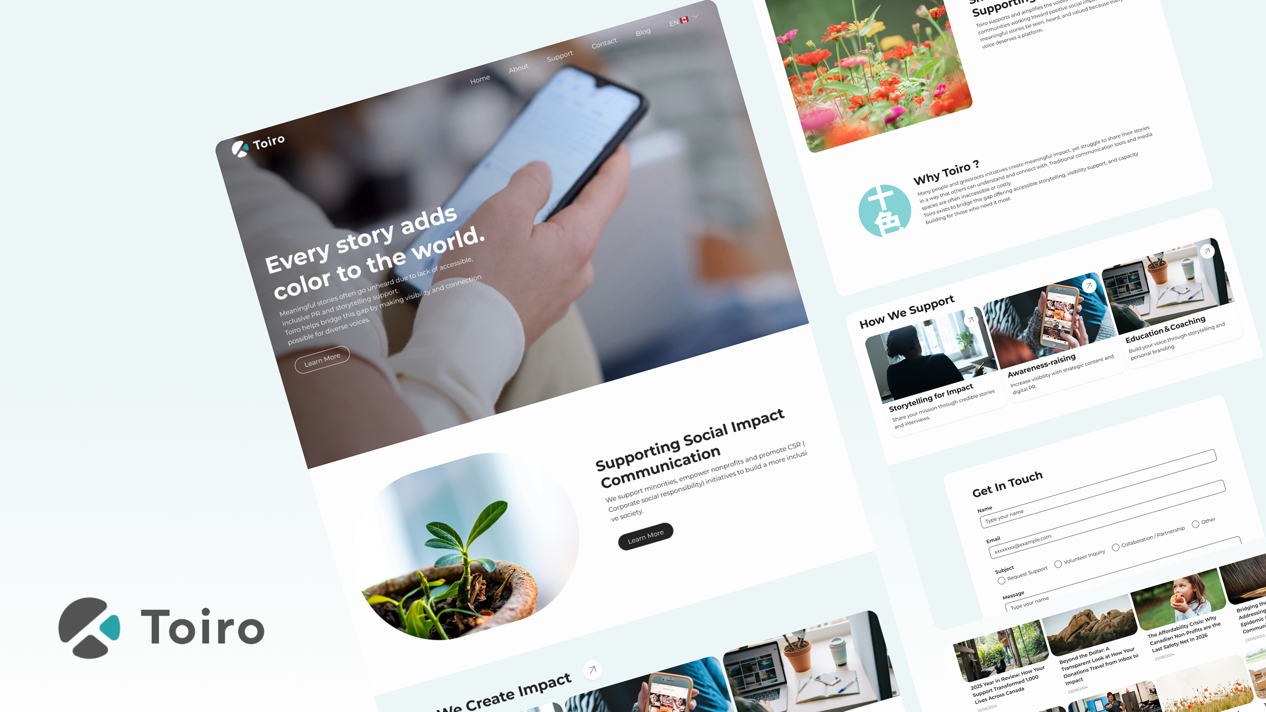
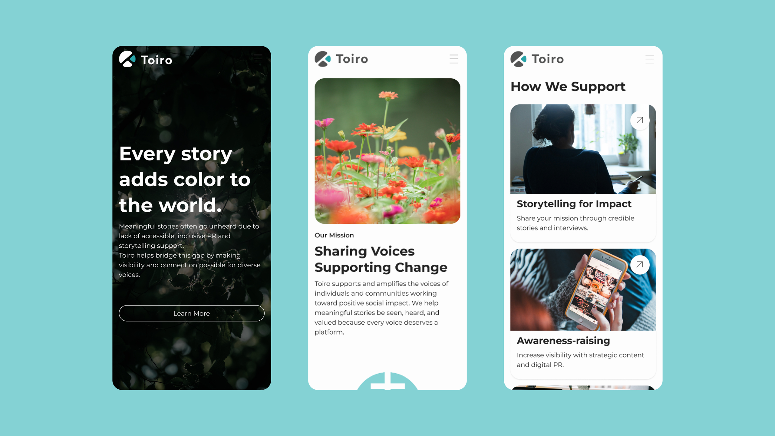
Based on my findings, I created a new sitemap and content structure. I decided to highlight the problem statement, mission, and impact on the homepage. Because the organization is still relatively new and does not yet have many case studies, I chose to include a blog section instead.
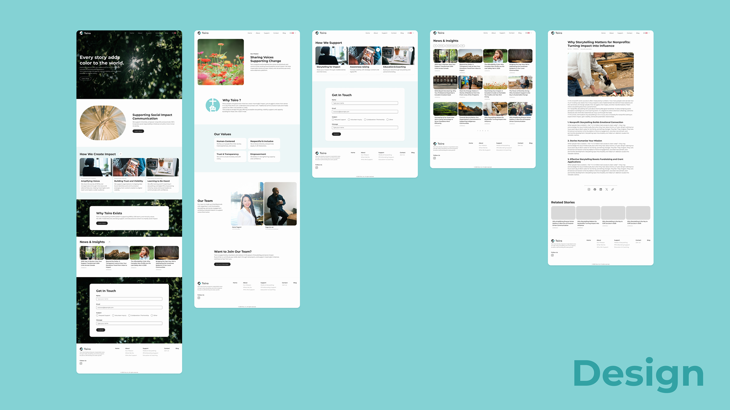
I also defined the color palette and typography according to the brand guidelines. The brand’s core colors are teal, dark gray, and off-white, so I expanded the palette with additional shades of gray and teal. Montserrat was selected for typography because its geometric shape aligns well with the brand logo.
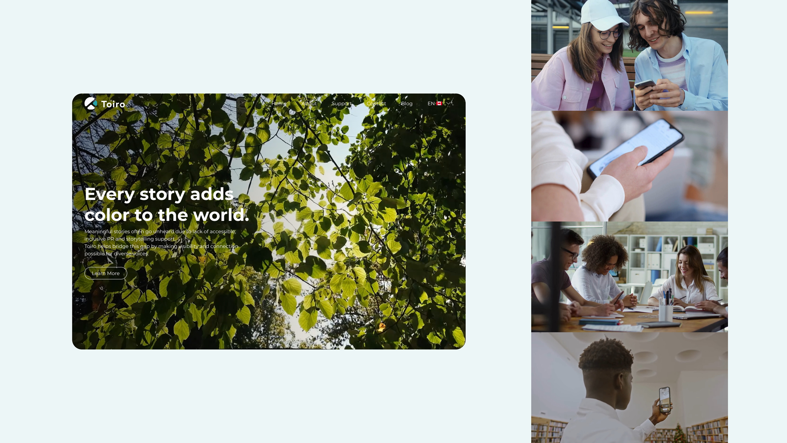
After reviewing the visual guidelines emphasizing calm imagery, human elements, and natural tones, I chose nature-based visuals such as trees and flowers. I also decided to use the term “Support” instead of “Service” to avoid a commercial tone. WordPress was selected as the platform to align with the existing site.

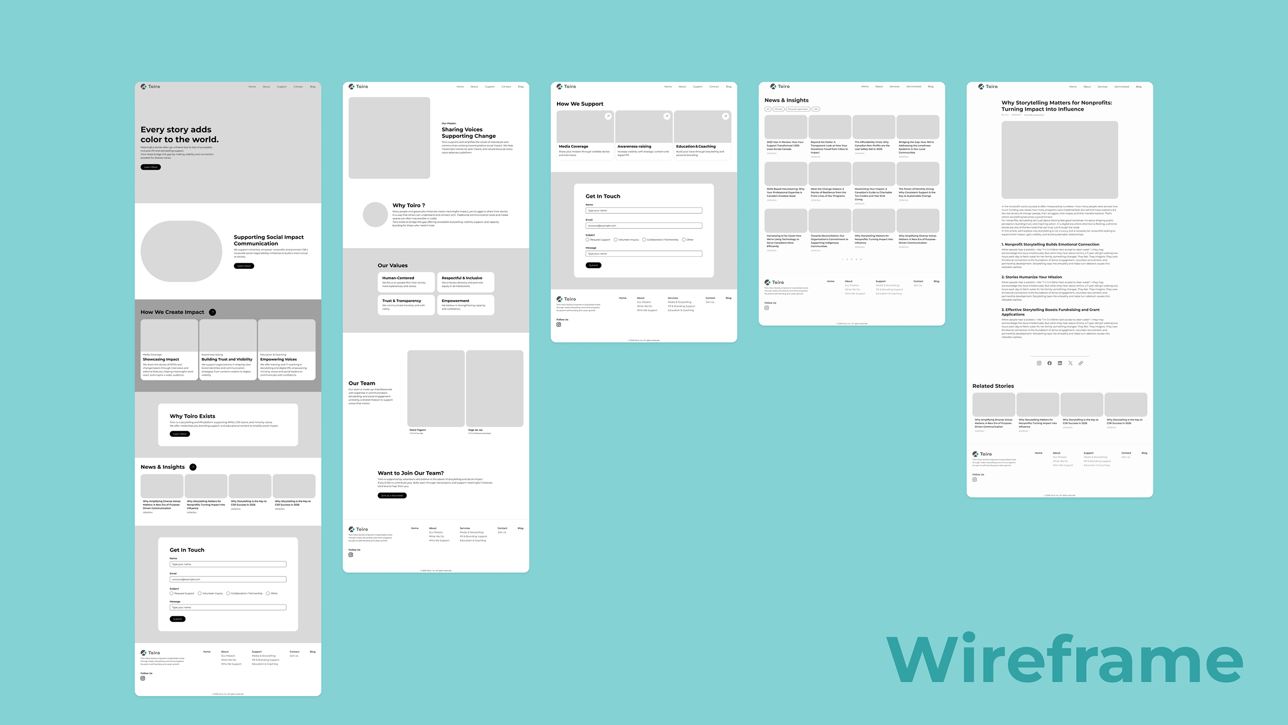
STEP3: Develop
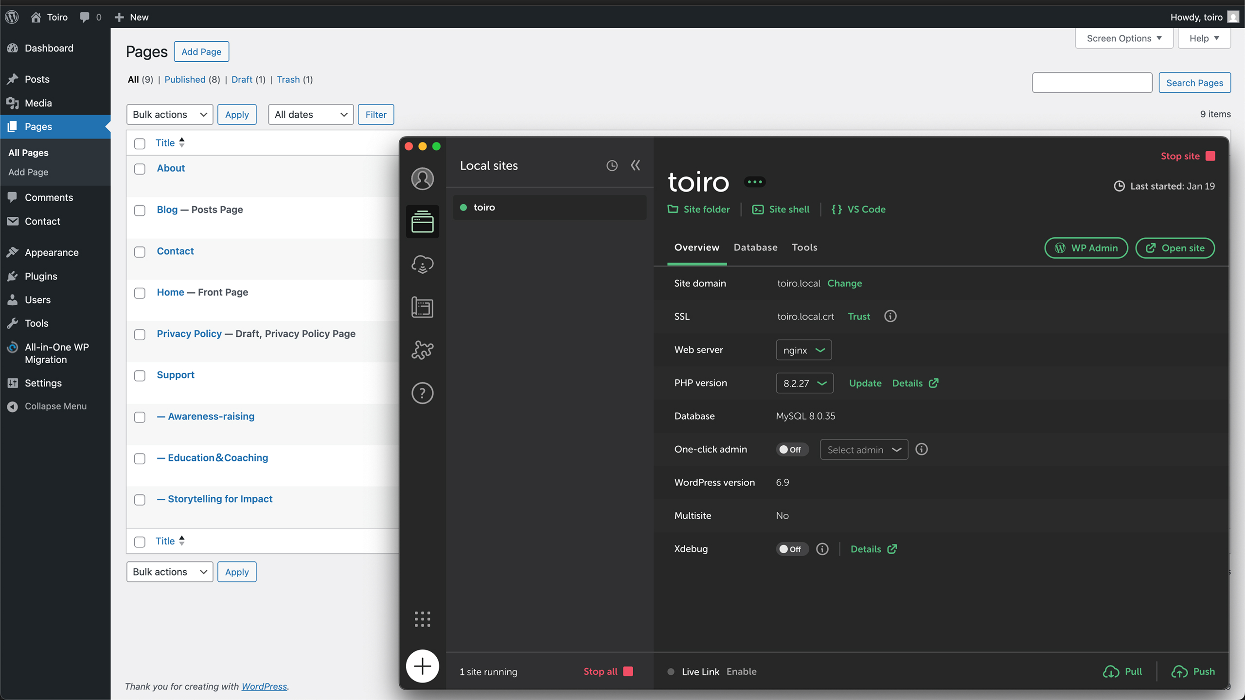
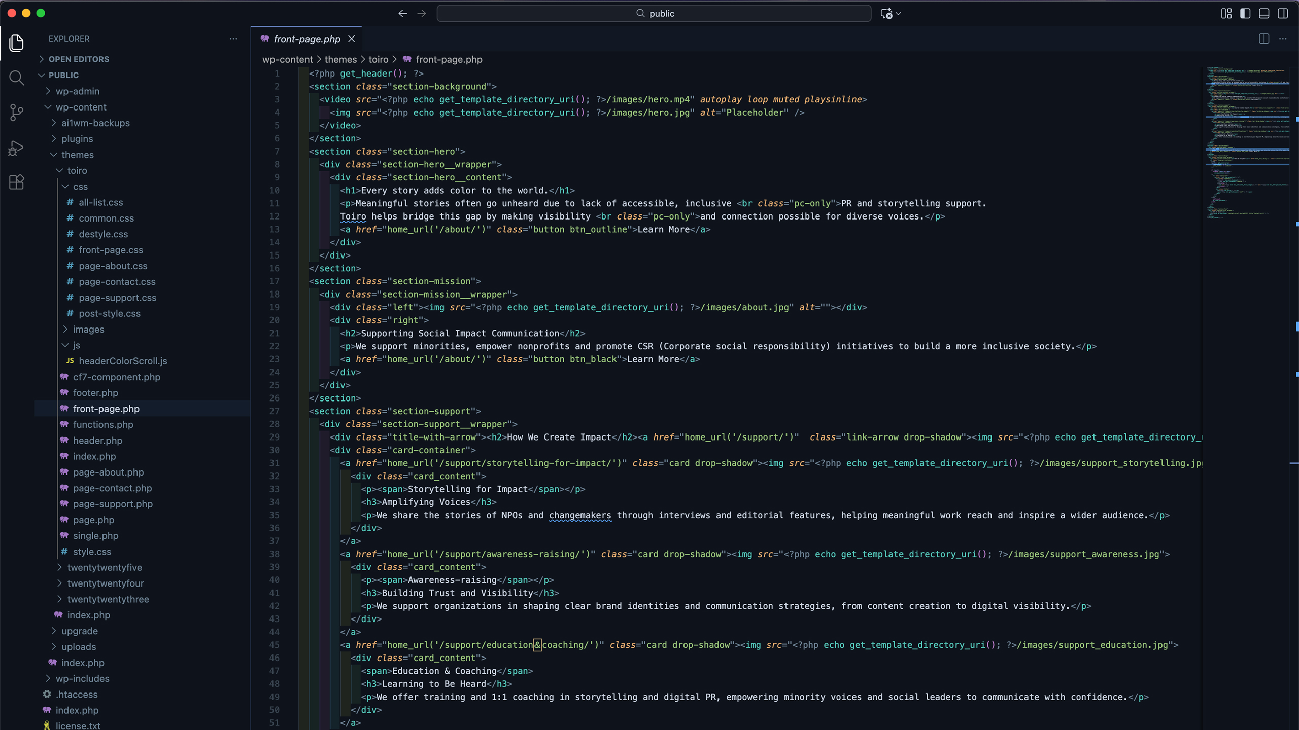
I designed key pages and then built a custom WordPress theme from scratch. I set up a local WordPress environment and developed the site using HTML, CSS, JavaScript, and PHP. Responsiveness and usability across different screen sizes were applied throughout the development process.
STEP4: Deliver
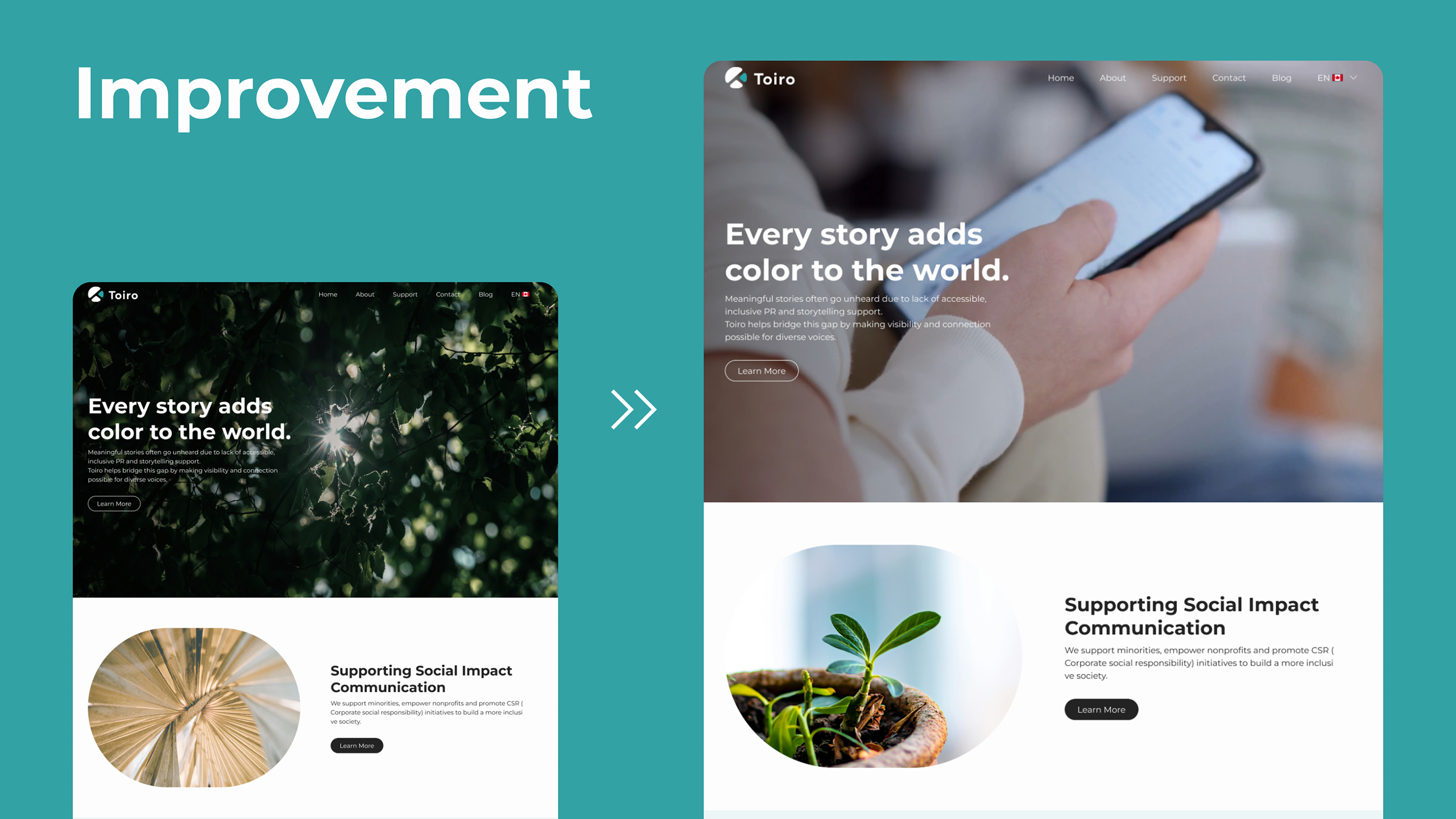
After completing development, I received feedback that some homepage visuals were unclear and not strongly connected to the organization’s services. I explained my design concept based on the meaning of “Toiro”, which translates to “many colors” in Japanese. Sunlight passing through trees reflects multiple colors, similar to a rainbow, which aligns with the organization’s values of diversity and storytelling.
Based on this feedback, I refined the visuals by using imagery and video that more clearly supported themes such as storytelling and awareness-raising. I then published the demo site and presented it to the organization’s directors, who responded positively and expressed interest in using the design long term.
Outcome
The redesigned website clearly communicates the organization’s mission and impact at first glance, making it easier for first-time visitors to understand and engage with the content.
As a next step, the design will be implemented into the production website in a no-code-friendly way, allowing the team to update and manage content long term without technical knowledge. This ensures the website remains sustainable and adaptable as the organization grows.
Takeaways
This project emphasized the importance of user-centered design, particularly for first-time visitors. I learned that clearly communicating an organization’s mission and impact at a glance is essential for engagement, especially in nonprofit websites where users often seek purpose-driven information.
I also strengthened my understanding of information architecture and content prioritization. Defining what users need to see first and designing clear visual hierarchy helped transform complex information into an intuitive experience.
Additionally, this project highlighted the value of designing with long-term usability in mind. Creating a balance between structured design and flexible, no-code-friendly updates ensures a better experience not only for users, but also for the teams managing the site.