Pawomics
Project Overview
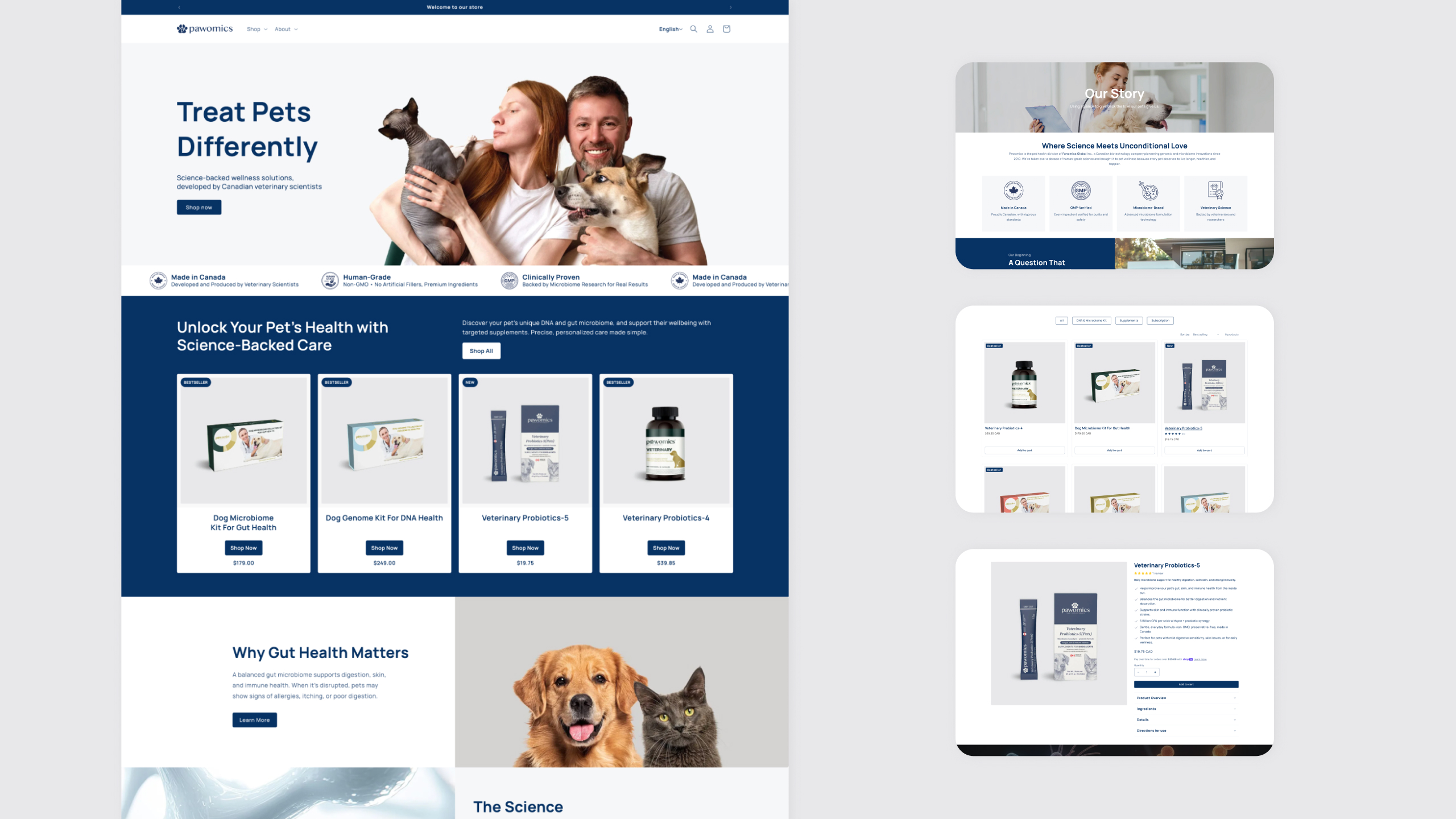
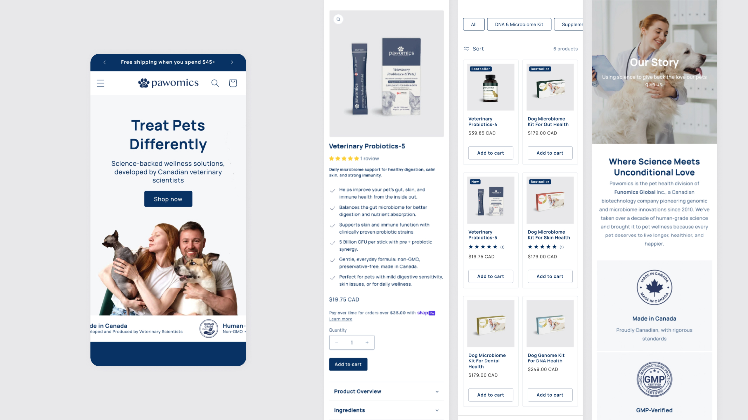
Pawomics is a pet health brand that applies microbiome science to help pet owners better understand and care for their pets. This project focused on redesigning and developing a responsive Shopify website that clearly communicates the brand’s scientific credibility while remaining warm, approachable, and easy to use across devices.
View WebsiteRole
UI/UX Designer & Developer
Collaborators
Marketing Director
Graphic Designer
Developer
Project Duration
15 Oct 2025 - 30 Nov 2025
( 6 weeks )
Challenge
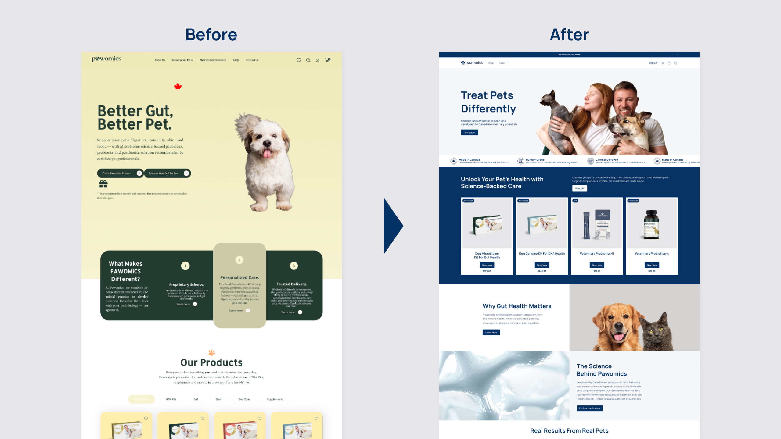
The main challenge was redesigning an existing website and delivering a production-ready experience within a short timeframe. While the site was already live, it lacked mobile optimization and UI consistency, making iteration slow and inefficient. In addition, the redesign needed to balance scientific credibility with emotional storytelling to build trust with pet owners.
Solution
I led the UI/UX redesign and Shopify implementation, focusing on improving usability, consistency, and responsiveness. By standardizing layouts, typography, spacing, and components, I enhanced clarity and ease of use on both desktop and mobile.
Approach
STEP1: Discover
I began by researching competitor websites such as Fera Pets, PetLab Co., and AnimalBiome to understand common page structures, sections, and functionalities within the pet health and microbiome space. Through this analysis, I identified industry standards as well as opportunities for differentiation.
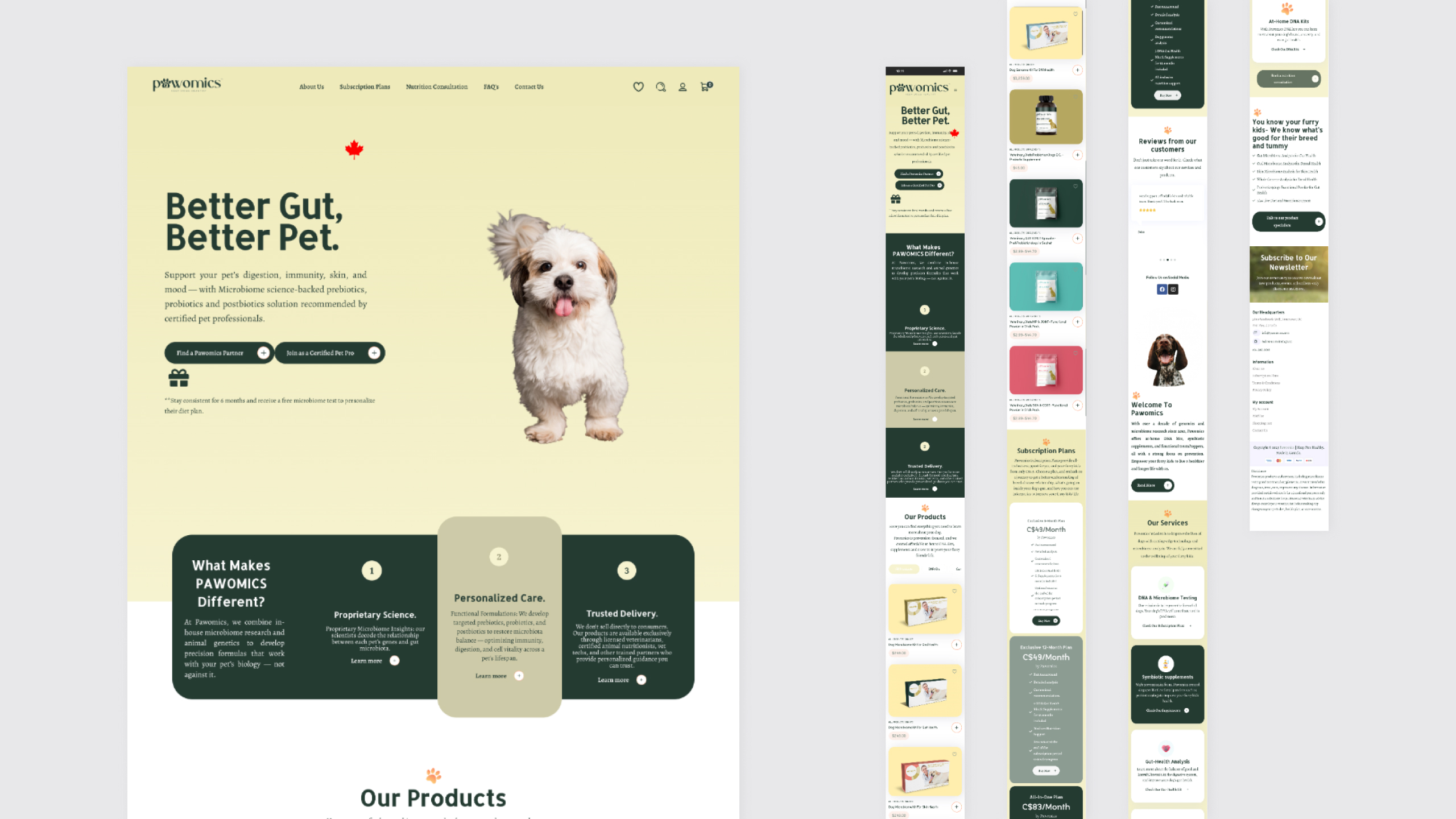
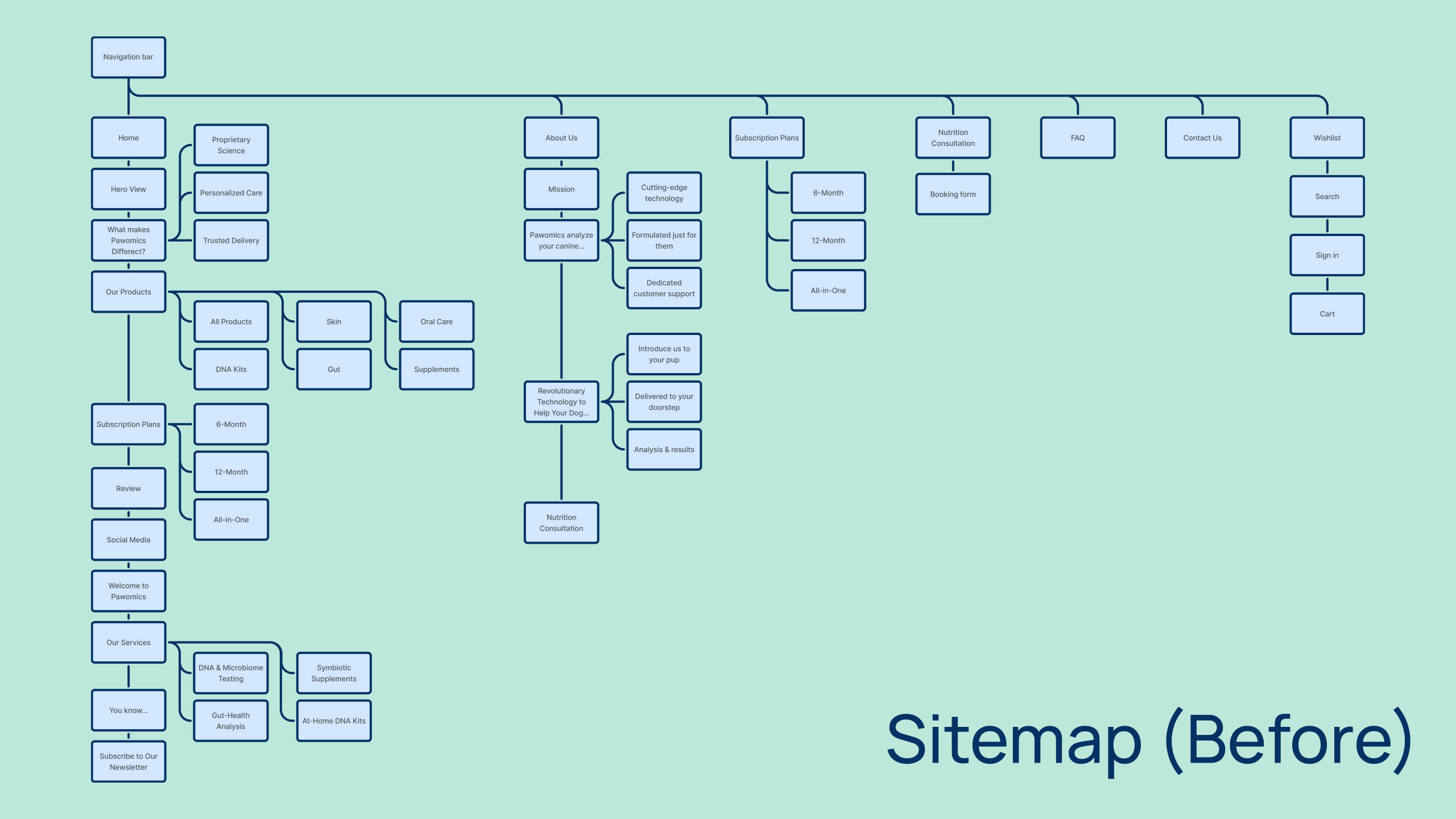
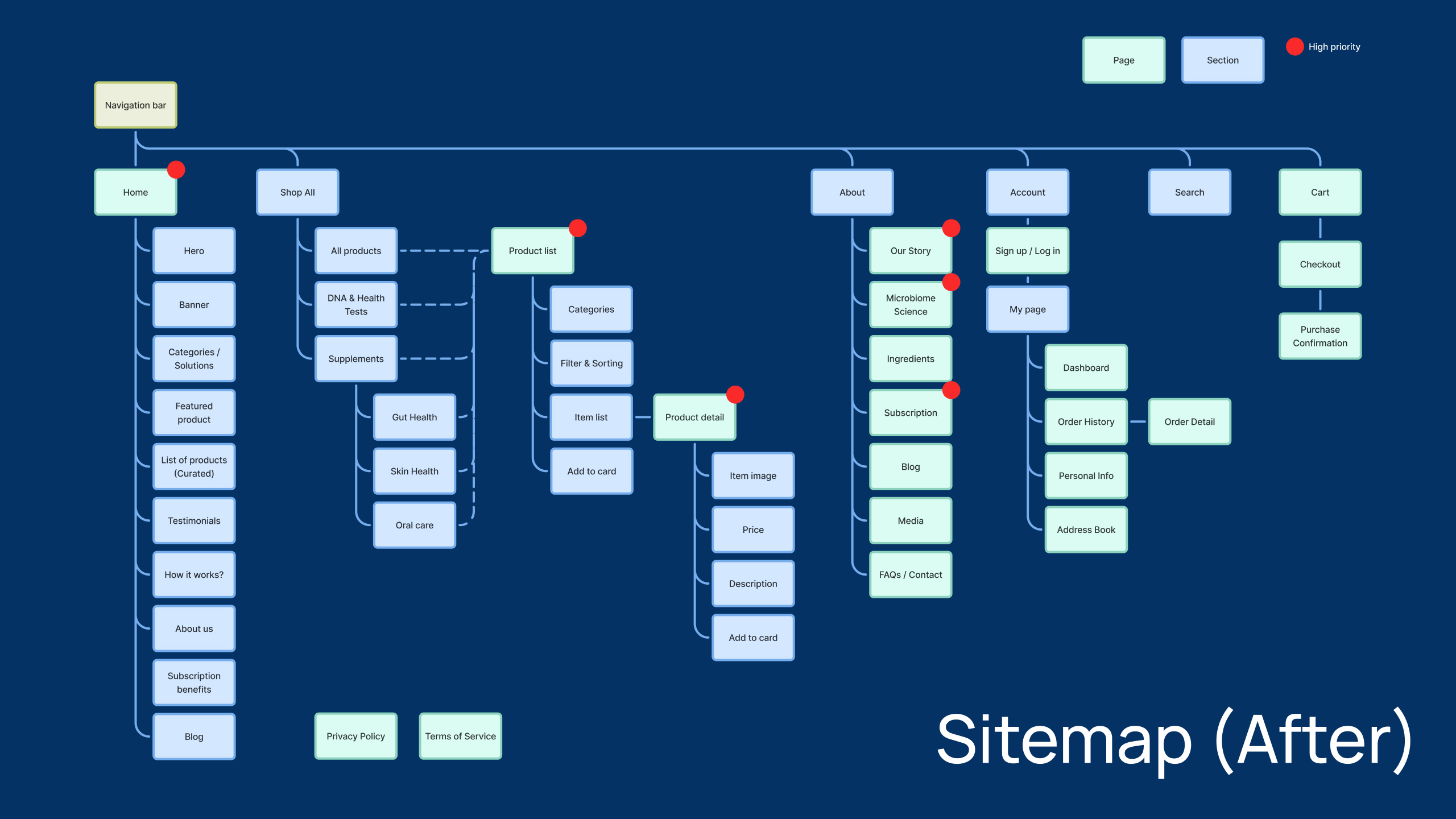
At the same time, I evaluated the existing Pawomics website and found several usability issues. Sections were not clearly organized into appropriate pages, and the top page was overly long, making it difficult to browse especially on mobile devices. I audited which sections currently existed, confirmed which ones the team wanted to keep for the redesign, and identified missing but necessary sections. Based on these findings, I proposed a new sitemap to improve information architecture and navigation. I also confirmed the desired overall atmosphere and brand direction for the new website, which later informed the style guide.
STEP2: Define
Based on the research insights, I collaborated closely with another designer who was mainly responsible for product package design to develop a cohesive visual direction across both digital and physical touchpoints. It was important to ensure consistency between the website and the actual product while maintaining clarity and usability.
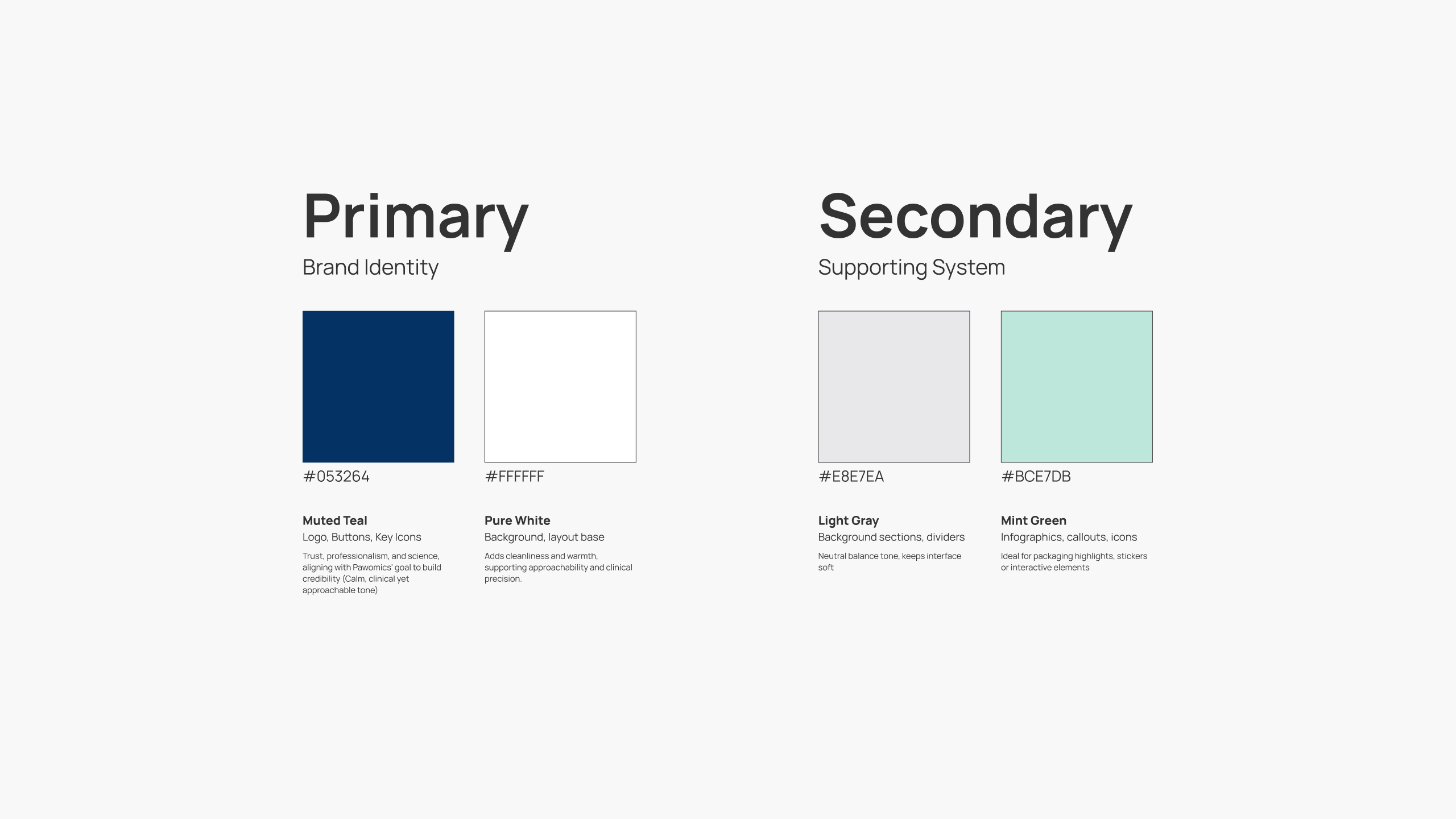
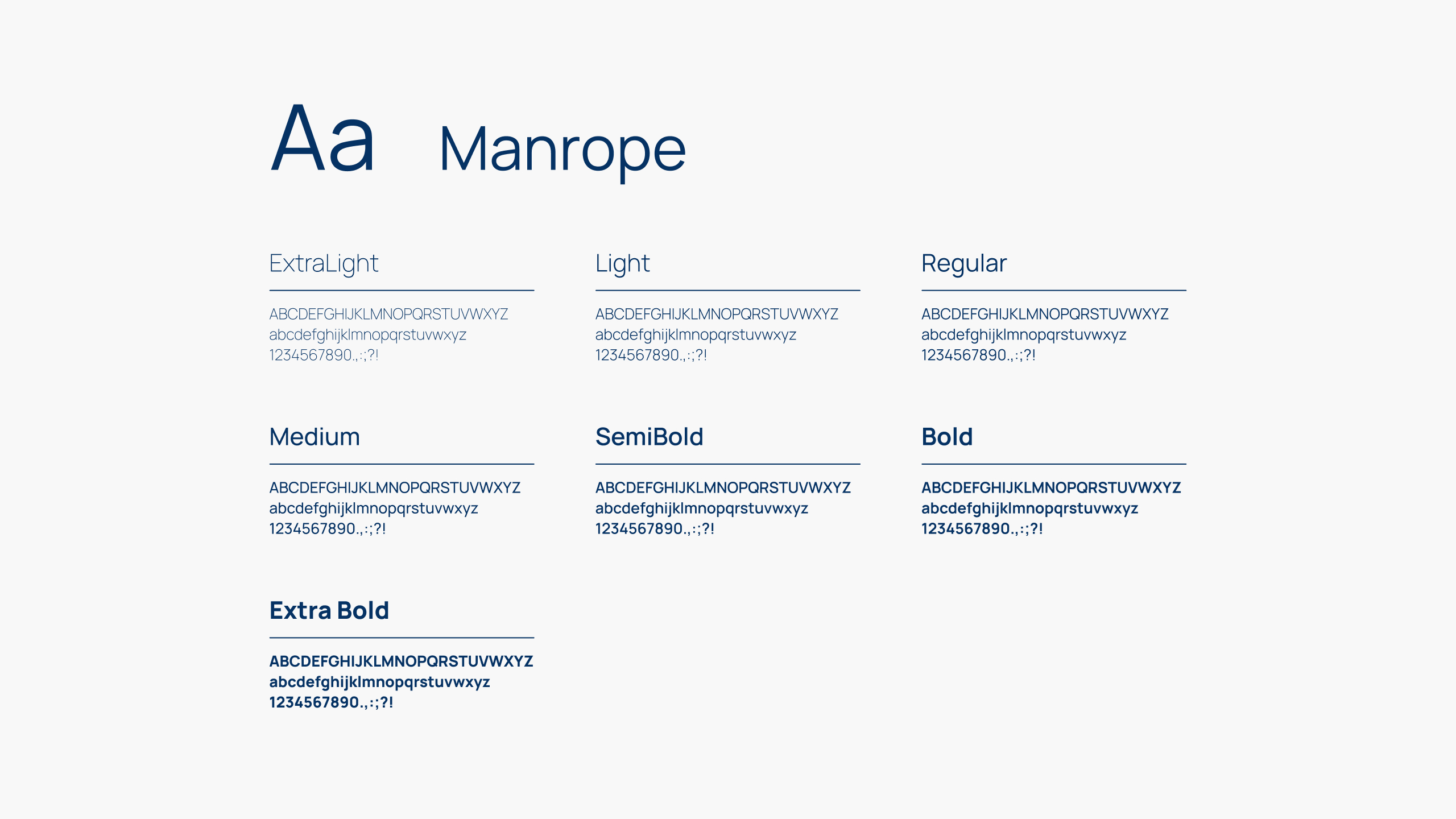
Since the marketing director aimed to position the brand as more luxurious and science-driven, targeting well-educated and quality-conscious pet owners, we selected dark blue and white as the primary color palette. Typography selection was particularly challenging. Initially, we proposed using different sans-serif fonts for headings and body text, but the director requested a serif font for headings to convey a more classical feel. After further discussion, the decision was revised to use a sans-serif font for both headings and body text to achieve a more scientific and professional impression.
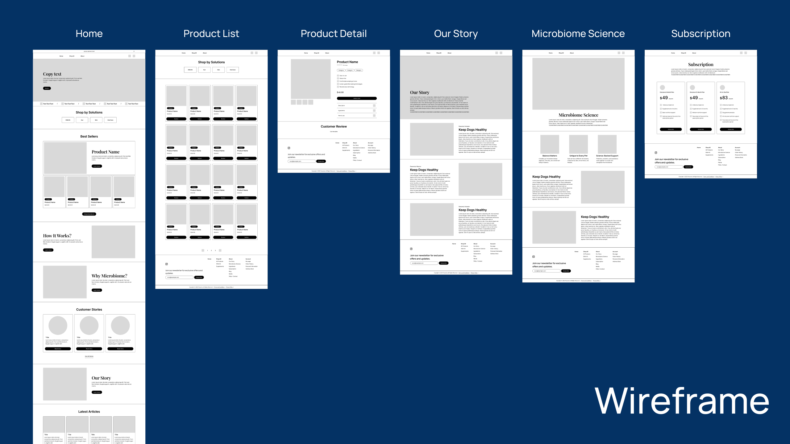
At this stage, the content for each page had not been finalized. To accommodate future changes, we designed flexible wireframes that allowed sections to be adjusted, expanded, or reorganized during development without breaking the overall layout.
STEP3: Develop
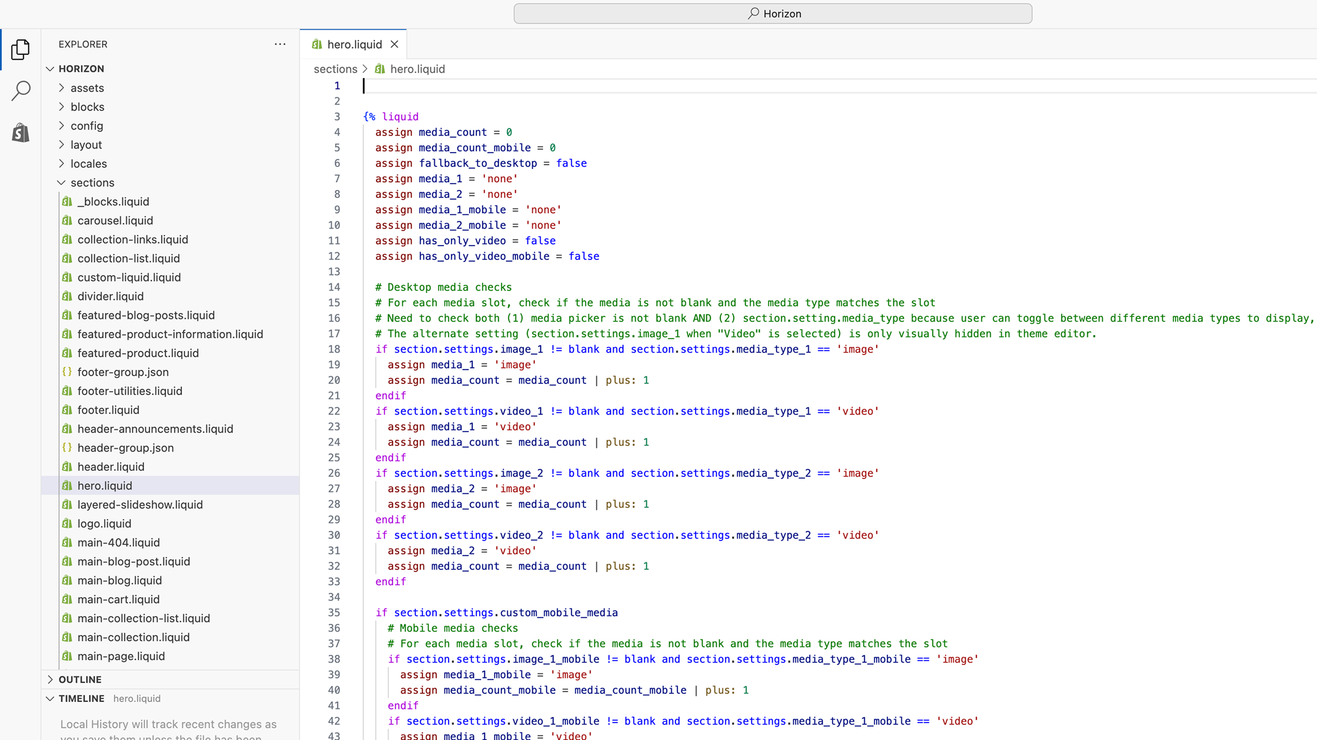
The development phase was carried out using an existing Shopify theme as a base. While the developer handled the core page development, I supported the process by adjusting layout details such as spacing, typography, colors, and imagery, as well as ensuring full responsiveness across devices.
This phase took longer than initially expected because content was not fully prepared in advance and continued to be added and revised throughout development. As a result, layouts required frequent adjustments. Additionally, since Pawomics was scheduled to participate in an upcoming expo, we were working under a strict deadline. To manage this, I prioritized pages based on the sitemap I had defined earlier, focusing first on completing high-impact and essential pages, then refining details as time allowed.
STEP4: Deliver
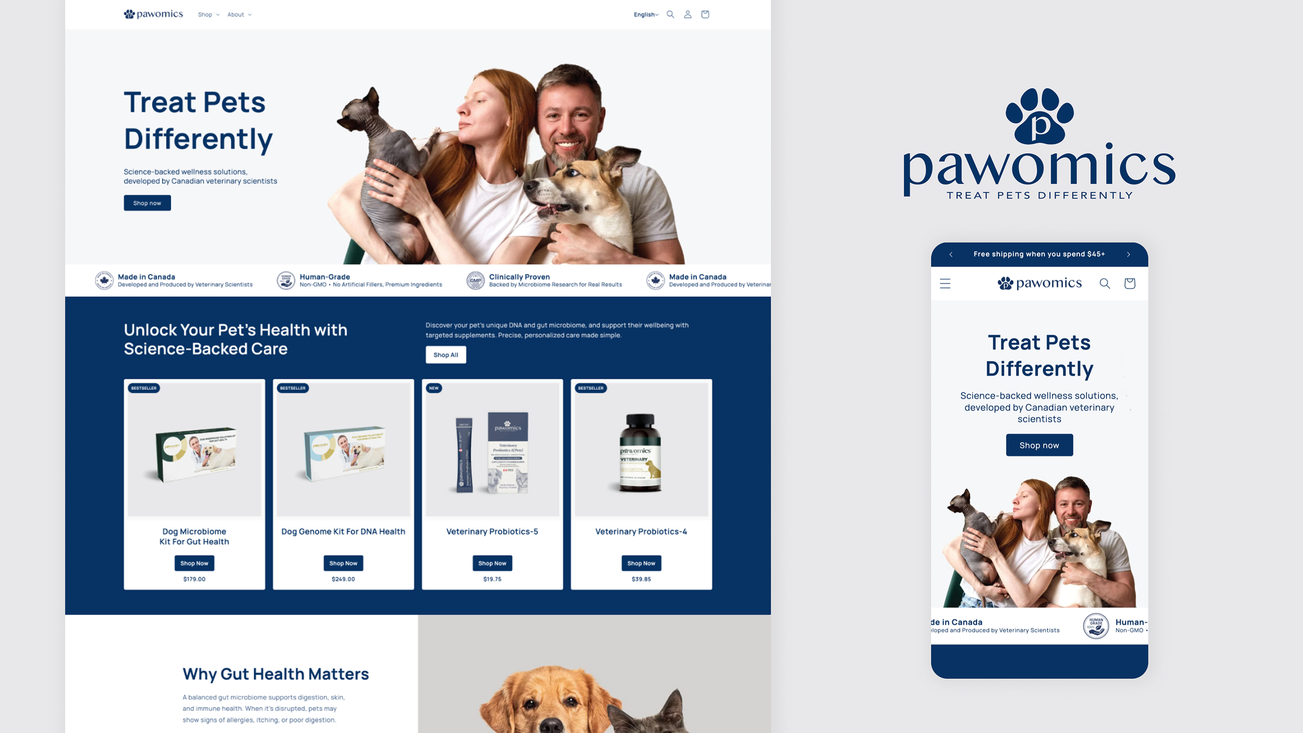
We successfully delivered the redesigned Pawomics website in time for the expo launch. The final outcome provided a clearer information architecture, improved mobile usability, and a more cohesive brand experience aligned with Pawomics’ scientific and premium positioning.
After launch, we identified opportunities for further improvement, such as refining components and separating CSS from Liquid files on Shopify. These insights informed a roadmap for future iterations, allowing the website to continue evolving beyond the initial release.
Outcome
We successfully launched the redesigned Pawomics website in time for the expo, meeting a tight deadline while coordinating design, development, and content updates in parallel.The new website features a clearer information architecture, significantly improved mobile usability, and a cohesive visual system that reflects Pawomics’ science based and premium brand positioning.
By prioritizing key pages and optimizing responsiveness, the website now provides a more intuitive user journey for first time visitors, especially on mobile devices, while supporting business goals such as product discovery and subscription conversion.
Takeaways
This project reinforced the importance of flexibility and prioritization in real world web projects, especially when content and requirements continue to evolve during development. Working within Shopify highlighted the value of designing modular, adjustable components that can be updated without heavy engineering effort.
I also learned how critical cross functional collaboration is when aligning branding, UI design, and development under tight timelines. Balancing ideal UX decisions with technical and time constraints allowed me to deliver a practical, scalable solution while maintaining design quality.