GlobalBites
Project Overview
This project began when a friend of mine, who is a developer, wanted to create a recipe website for his portfolio. At the same time, I already had a draft design for a global recipe app that I had created previously. We decided to collaborate and adapt my existing app design into a website version that would better fit his development goals.
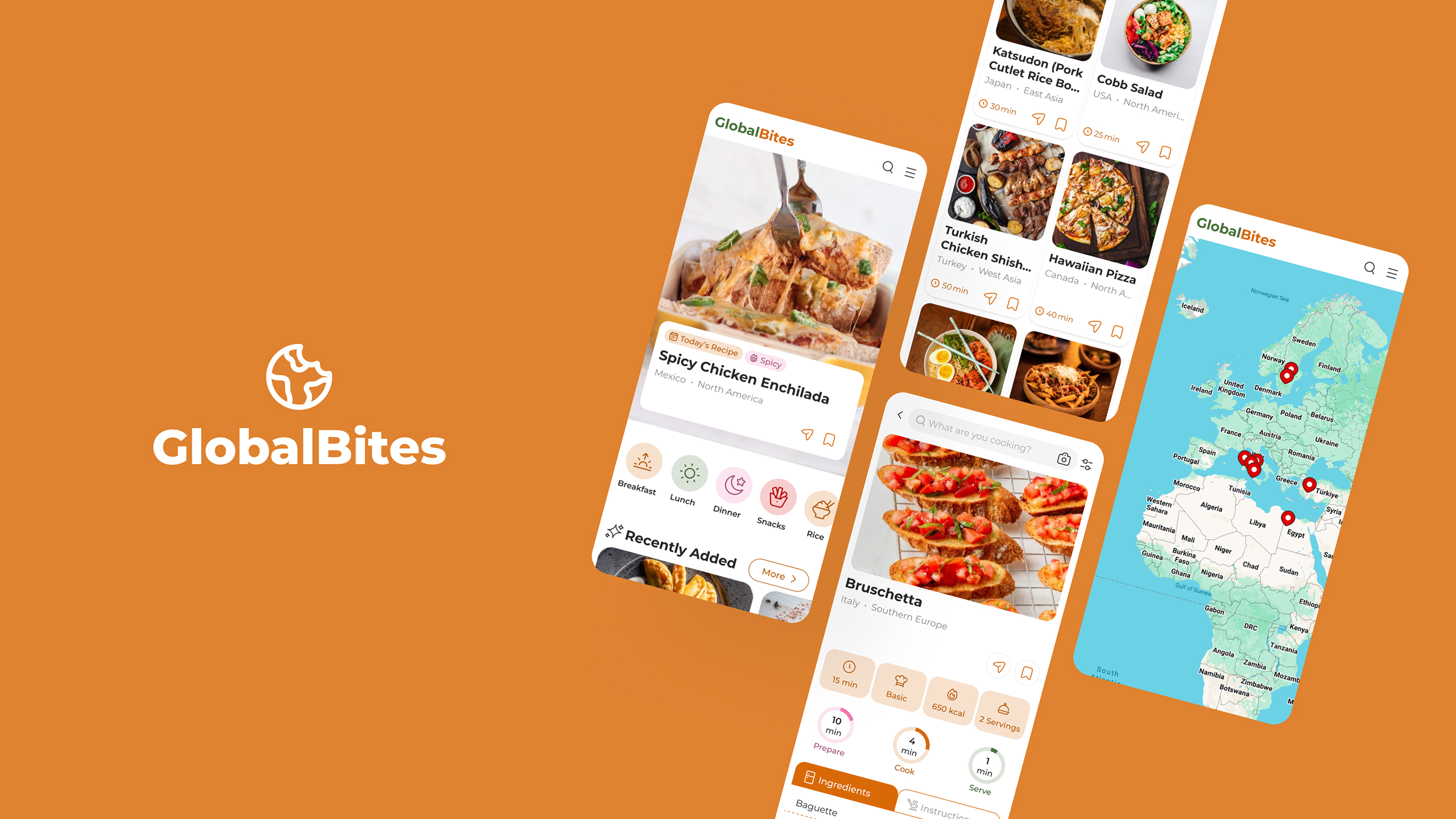
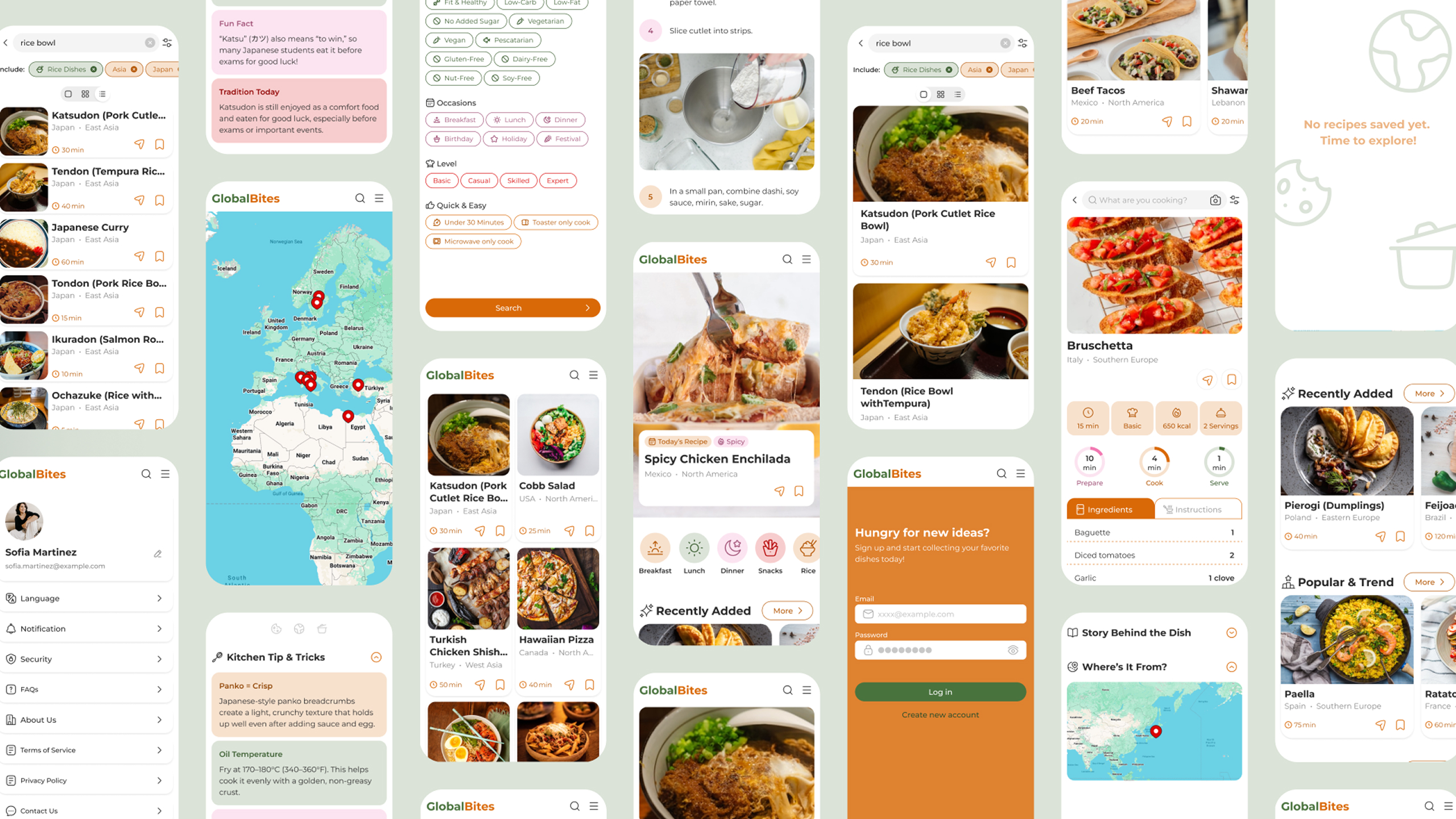
The original app concept was a global recipe app that allows users to search for international recipes while also learning about the cultural background behind each dish. In addition to cooking instructions, the app provides tips such as the history of the dish, the meaning behind its name, and cultural facts related to food traditions.
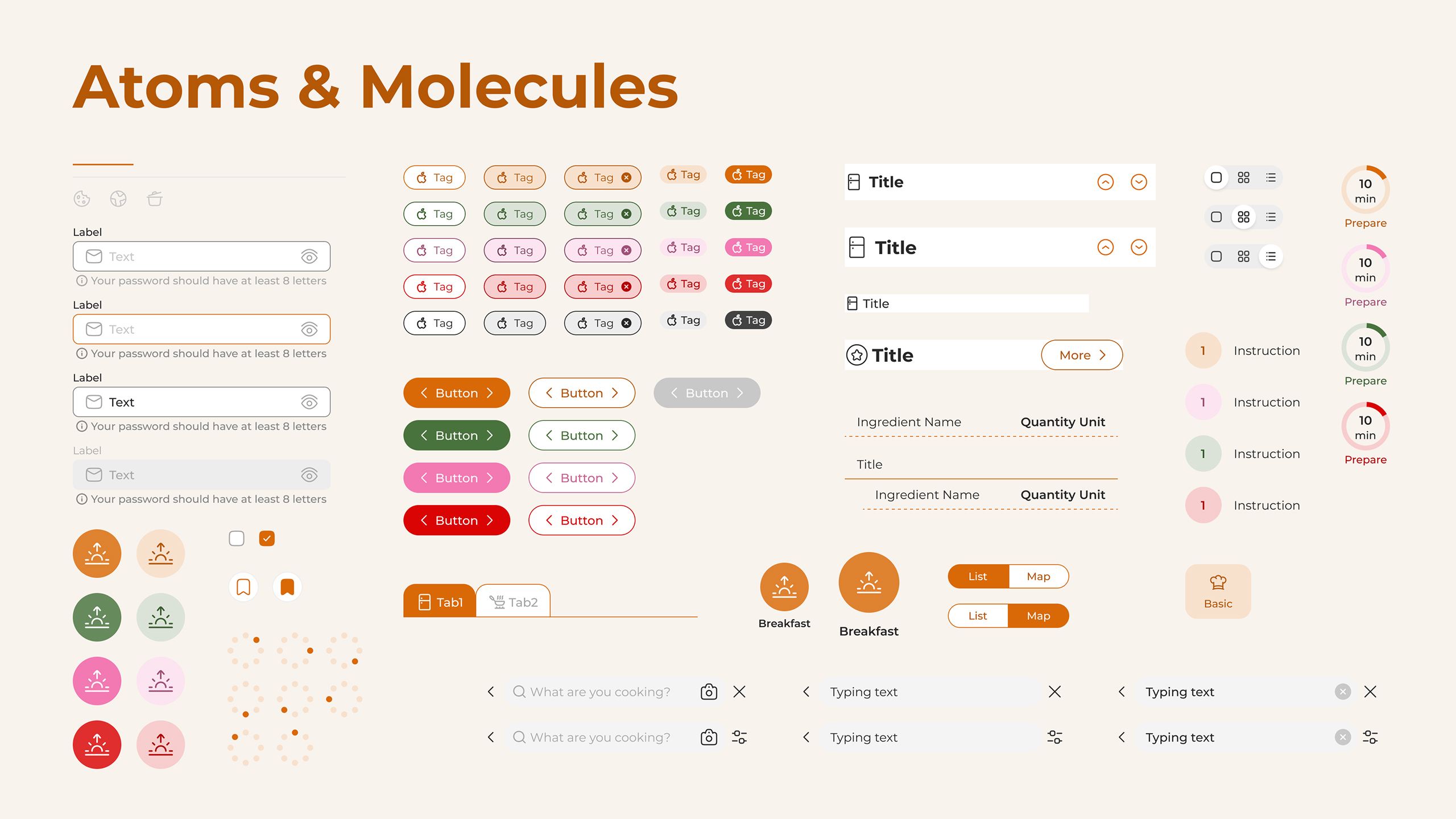
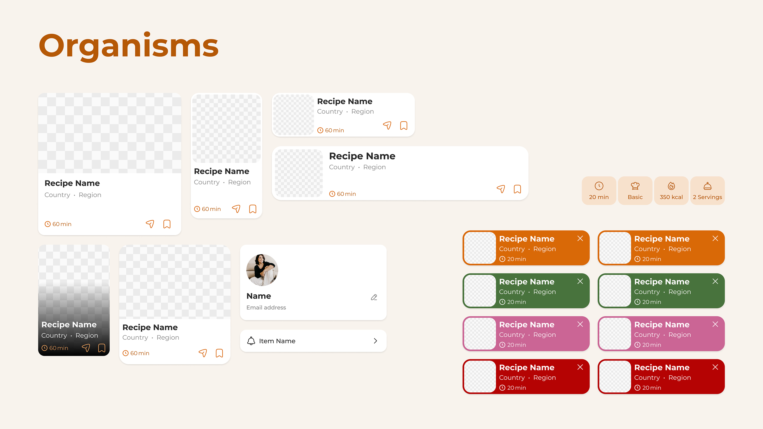
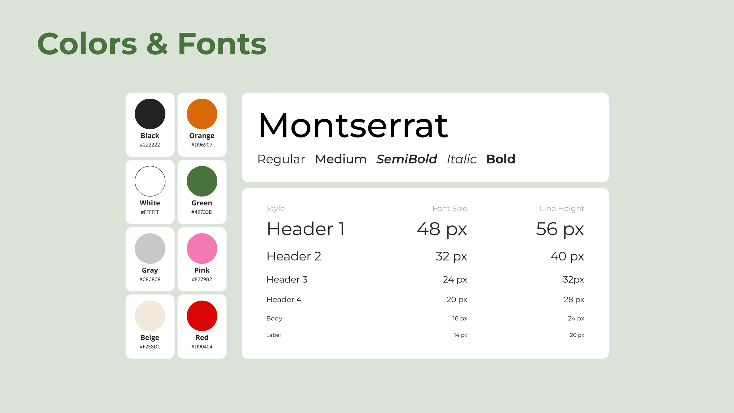
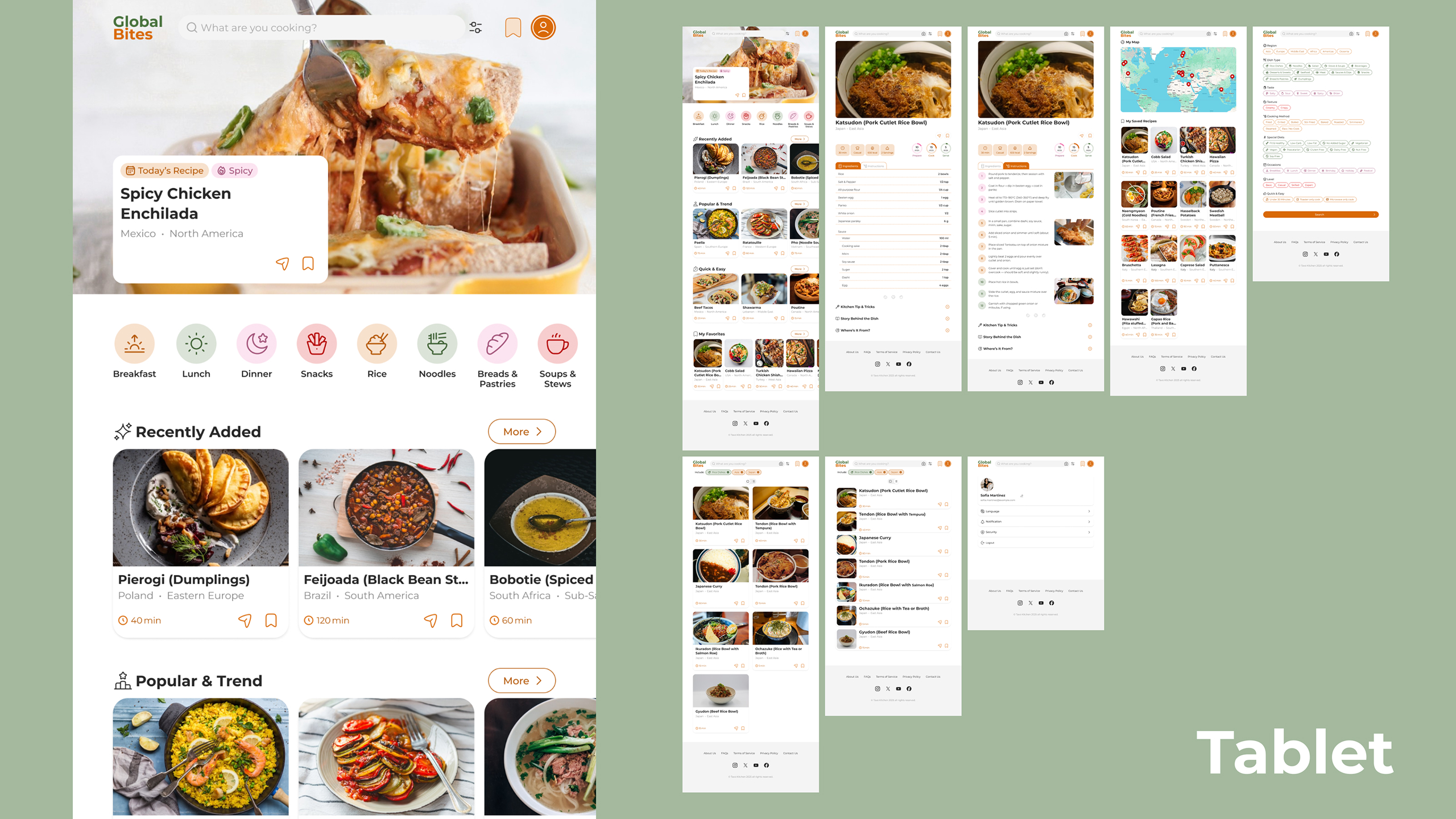
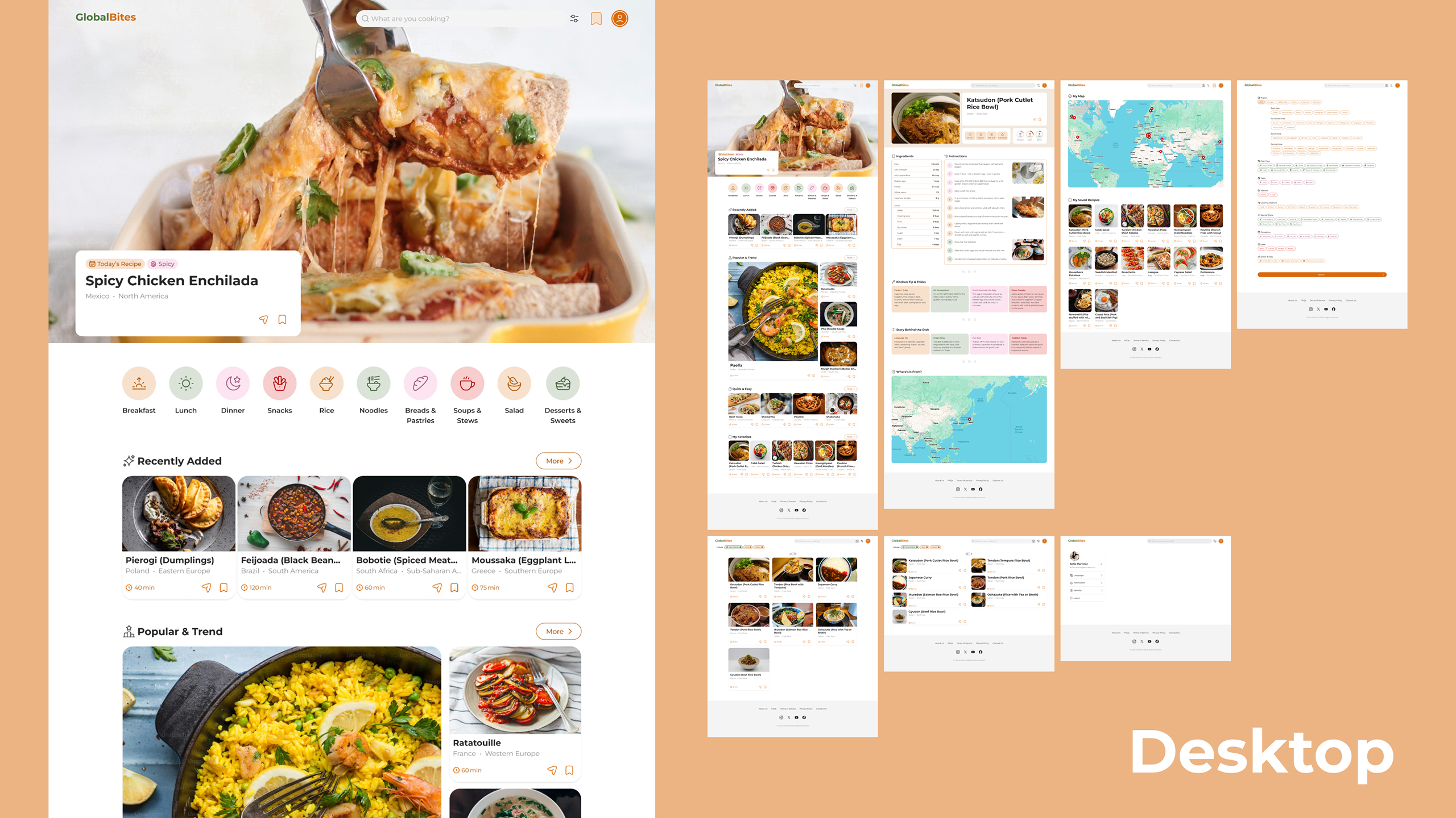
The original design followed atomic design principles and was built with a mobile-first, responsive approach, supporting mobile, tablet, and desktop experiences. For this project, my role was to redesign and refine the interface so it would work effectively as a website while maintaining visual consistency with the app.
Role
UI/UX Designer
Collaborators
Developer
Project Duration
9 Sep 2025 - 1 Oct 2025
( 3 weeks )
Challenge
The main challenge was converting a mobile app design into a website experience. While the concept remained the same, the layout, navigation, and interaction patterns needed to be adjusted to fit web standards and user expectations.
Solution
To solve this, I redesigned key components and navigation to better suit a website while keeping the original visual identity. I focused on usability, responsiveness, and consistency across devices, and collaborated closely with the developer to align design decisions with technical needs.
Approach
STEP1: Discover
The research phase was completed during the original app design process. At that time, I conducted user research including card sorting and tree testing to validate the information architecture. I also created user flows and a sitemap to define key tasks and navigation structure. These insights became the foundation for adapting the design to a website.
STEP2: Define
In this phase, I shared the prototype with the developer and explained the user flows and overall structure. Together, we reviewed which pages and flows were necessary for the website and which could be simplified or removed. For the visual style, I decided to keep the same color palette and typefaces as the app version to maintain brand consistency, while adjusting layouts to fit the web experience.
STEP3: Develop
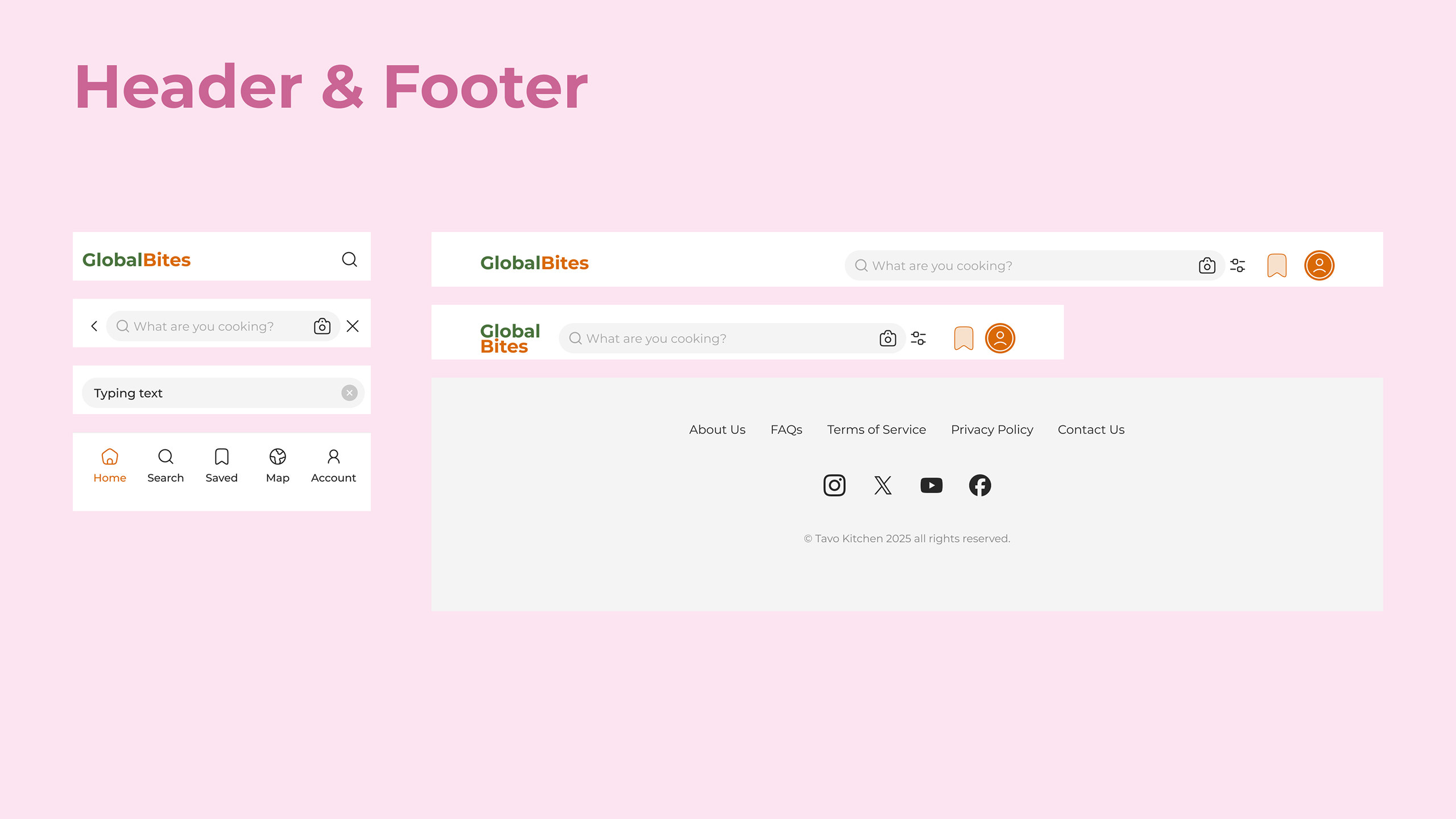
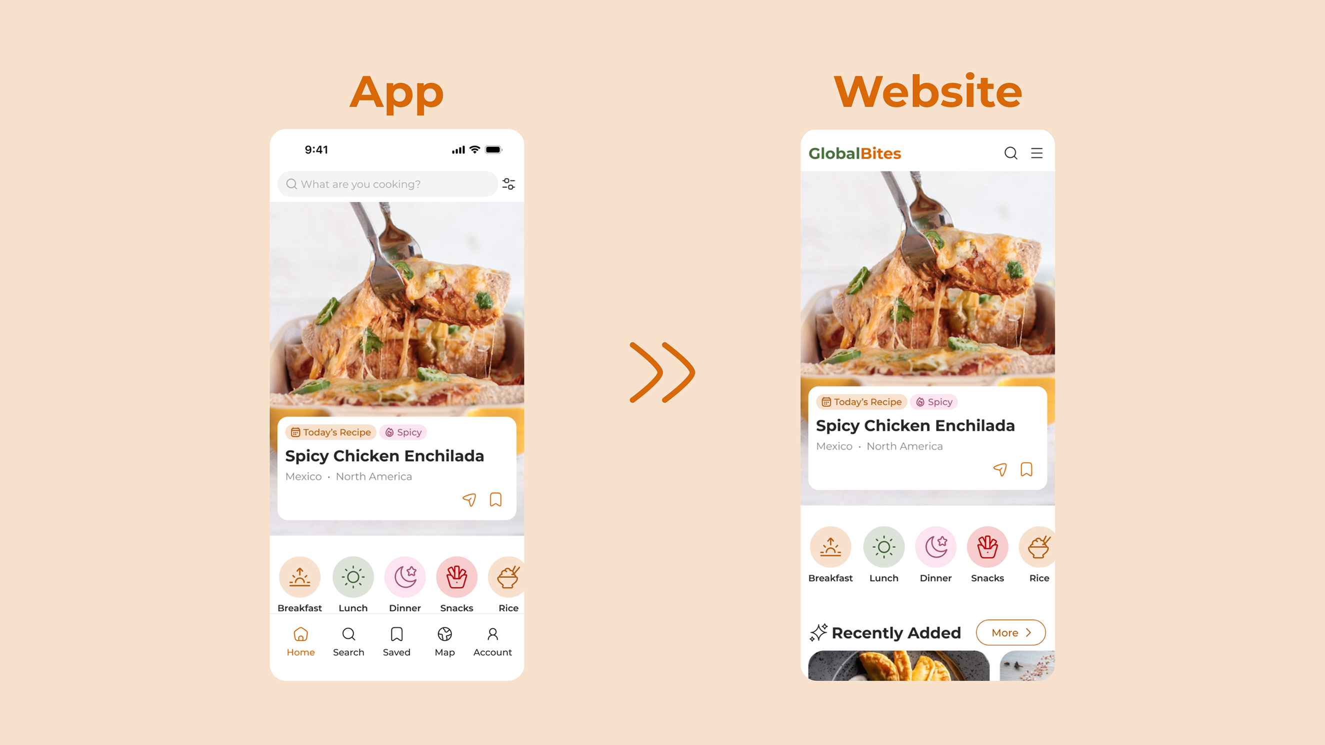
I adjusted the design from an app-focused interface to a website-focused layout. For example, the bottom navigation bar used in the app was replaced with a hamburger menu for the website. I also redesigned layouts to work better on larger screens and removed mobile-specific considerations, such as device notches, while ensuring the site remained responsive.
STEP4: Deliver
After finalizing the website design, I handed off the designs to the developer along with explanations of the layout and interactions. This ensured a smooth transition from design to development and helped maintain design accuracy during implementation.
Outcome
The final result was a responsive global recipe website that successfully translated the original app concept into a web experience. The website allows users to discover international recipes while also learning about the cultural stories behind them, combining usability with educational value.
Takeaways
This project helped me strengthen my ability to adapt designs across platforms while maintaining consistency and usability. I also gained valuable experience collaborating with a developer, reusing research effectively, and applying responsive design principles in a real-world project.